blog.kissmetrics.com/too-many-choices/
The Benefit Of Keeping Home Pages Simple
When it comes to home pages, there’s a lot to cram onto one page. It seems that everything the customer may ever want needs to be available on the first page they’ll see.
That’s not the way to design a home page.
Instead, the question needs to be asked about what can be left out. Good design is not when every possible feature is included; it’s when every possible feature is removed that can be.
Below are two examples that illustrate this point:
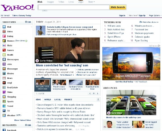
A bad home page example
Where is the emphasis on this page? Is there anything in particular readers are supposed to look at? Is there any element that is more important and appropriately emphasized more?
Unfortunately for Yahoo, the answer is no. Search isn’t emphasized, Yahoo sites aren’t emphasized, and news isn’t emphasized. Everything is tacked on to one page with the result being too many options.
Instead of helping customers make one decision and complete the most important action, viewers are asked to view everything at once and then decide what to do. It’s overwhelming.
A good home page example
Google is the number one visited site on the internet, yet they’re still able to limit their home page to a single action: Would you like to search the internet?
How do they do it? How do they keep the home page of the number one site in the world limited to a text box and a search button?
Somehow they do, but the more important question is this: How much is this a factor in their success? Yes, they have the best search engine in the world, but they also make it stupid-easy to use. They don’t distract visitors with other options. Once you land on the site, you just have to decide one thing: What am I going to search for today?
How’s that for not giving customers too many choices?
The Google example is used as an extreme case. You should have a few text links to your most important internal content on your home page for better SEO architecture.